How to redesign a restaurant menu yourself
A practical owner-friendly process for turning a cluttered menu into a clearer, more professional sales tool — without hiring a designer first.
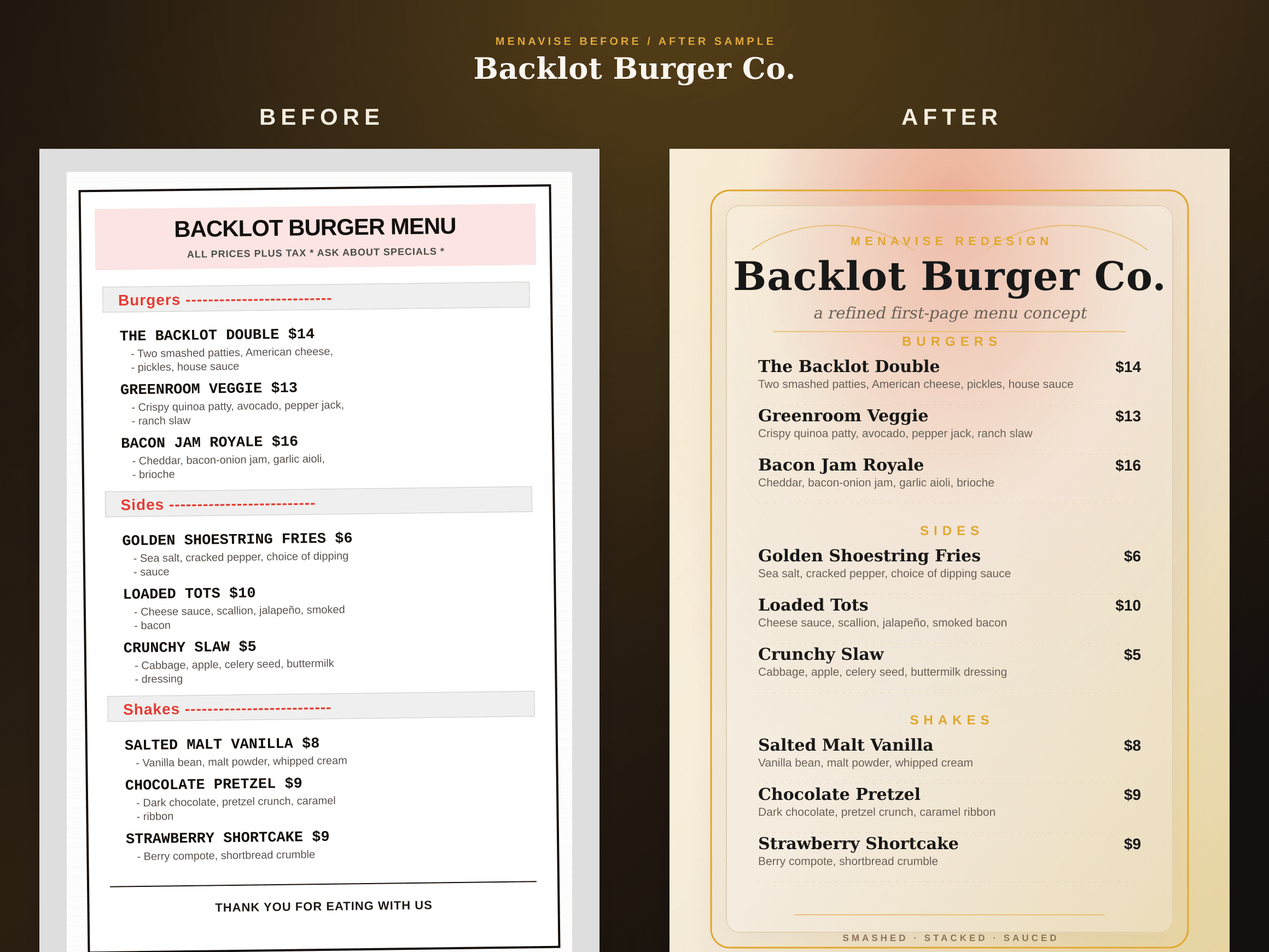
If you are searching for how to redesign a restaurant menu yourself, you probably already know the menu is not working as hard as it should. Maybe the page looks crowded. Maybe guests keep missing your best dishes. Maybe the food feels better in person than it does on paper. The good news is that a menu redesign does not have to start with fancy software. It starts with better decisions.
A professional-looking menu helps guests choose quickly, understand your restaurant's point of view, and feel confident about prices. It should not bury profitable items, force people to compare every dish by cost, or make your brand feel cheaper than the experience you actually deliver. Use the steps below to make the biggest improvements first, then use a free AI redesign preview to see how those choices can look visually.
Decide what the menu must sell first.
Before changing fonts or colors, mark the dishes that matter most to the business. These are usually your signatures, high-margin items, reliable crowd-pleasers, dishes with strong kitchen execution, or combinations that increase average check size. A menu redesign should guide attention toward those choices without making the page feel pushy.
Print your current menu and circle no more than three items per major section. If everything is circled, nothing is prioritized. Then note which items need support: a better description, a pairing suggestion, a small feature box, or simply more breathing room around the name. This quick exercise prevents the redesign from becoming decoration. It turns it into a sales plan.
Rebuild the structure around how guests order.
Many restaurant menus become confusing because they are organized around the kitchen, not the guest. A customer does not think in prep stations; they think in moments: snacks while deciding, starters to share, mains, sides, drinks, desserts, family meals, or lunch specials. Rename and reorder sections so the path through the menu feels natural.
Keep section labels plain unless the concept is already obvious. “Between Bread” can be charming for a sandwich shop, but “Handhelds” or “Sandwiches” may be faster for a busy counter-service lunch. For most restaurants, clarity beats cleverness. If a guest has to decode a heading, the design is making them work.
Also look for overloaded sections. If one category has twenty choices and another has four, guests will spend too long comparing. Split the large category into useful groups, remove weak sellers, or move add-ons into a short supporting line. Fewer decisions often create a better ordering experience.
Rewrite descriptions so they create appetite, not noise.
Menu copy should be specific enough to make a dish feel real, but short enough to scan. Replace generic adjectives like “delicious,” “fresh,” “amazing,” and “homemade” with concrete details guests can picture: charred scallion salsa, brown butter crumbs, slow-braised short rib, lemon aioli, toasted sesame, local peaches, or hand-cut fries.
A useful description usually answers one or two questions: what is the main ingredient, what makes it special, and what flavor should the guest expect? You do not need a paragraph for every item. Give premium or signature dishes a little more detail, and keep familiar staples tighter. Consistency matters too. If one burger description lists toppings, every burger should follow the same rhythm.
Fix pricing so it is clear without taking over the page.
Guests need to find prices easily, but you do not want the menu to become a spreadsheet. Long dotted lines and perfectly aligned price columns can encourage people to compare by cost before they consider value. A more modern approach is to keep the price close to the item name, with enough contrast to be readable but not so much that it dominates.
Check for pricing friction while you redesign. If a dish is meaningfully more expensive than nearby items, the description and placement must justify it. If add-ons are profitable, make them visible near the relevant items instead of hiding them at the bottom. If combos, sides, or drinks increase check size, use layout to make those next steps obvious.
Choose type and spacing for real restaurant conditions.
A menu that looks elegant on a laptop can fail in a dim dining room. Use enough font size and contrast for comfortable reading. Avoid thin decorative fonts for dish names or prices. One display font for personality and one simple text font for details is enough for most restaurants. More typefaces usually make the menu feel less professional, not more designed.
Spacing is the easiest way to make a menu look more expensive. Give section headers room. Keep item names, descriptions, and prices visually connected. Add more space between groups than between items inside a group. Do not fill every corner because the page exists. White space tells the guest where to pause and helps important dishes feel intentional.
Use photos and callouts with restraint.
Photos can help for takeout, delivery, fast casual, and unfamiliar cuisines, but a bad photo can hurt perceived quality faster than no photo at all. If you use images, choose a few strong dishes and keep the style consistent. Avoid mixing phone snapshots, stock photos, and heavily filtered images on the same page.
The same rule applies to boxes, stars, chef recommendations, spicy icons, and “popular” badges. A callout is useful only when it is selective. Highlight one signature dish in a section, not six. Give the eye a clear signal, then let the rest of the menu stay calm.
Common menu redesign mistakes to avoid
- Using tiny type to keep every old item instead of simplifying the offer.
- Making every dish bold, boxed, starred, or photographed so nothing stands out.
- Choosing a template that looks attractive but does not match your food, price point, or dining room.
- Treating descriptions as filler instead of using them to explain flavor, craft, and value.
- Forgetting to test the redesign on a phone, printed page, and dim-light setting.
Use AI after you know what good looks like.
AI is most useful when you give it a clear job. Instead of asking for a random “better menu,” use the checklist above first: identify priority items, simplify sections, tighten descriptions, and decide what the brand should feel like. Then a free AI redesign tool can turn those decisions into a visual direction much faster than starting from a blank template.
Menavise lets you upload a menu PDF or image and see a redesigned first-page preview for free. Use it as a quick second opinion: Does the hierarchy feel clearer? Are the signature items easier to notice? Does the menu finally match the quality of the food? If the answer is yes, you have a practical direction to refine, print, or hand to a designer.